Performance Dashboard & Charts
The Workload Dashboard inside Performance Analyzer provides interactive graphical visualizer charts for evaluating database load, query performance, storage consumption, and IO bottlenecks.
To open a data source's Workload Dashboard:
- Go to Performance Analyzer.
- Select the Datasources tab (or select a data source from the Overview feed).
- Click on the target data source row.
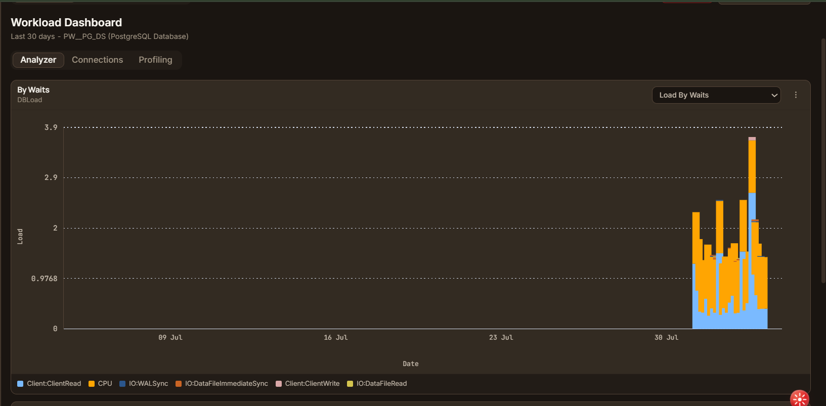
Sub-Tabs Navigation
At the top of the Workload Dashboard, sub-tabs allow you to pivot between different operational perspectives:
- Analyzer: The primary workload analytics dashboard containing time-series and resource breakdown charts.
- Connections: Monitors active database sessions, connection pool usage, and client host origins.
- Profiling: Detailed schema, table storage distribution, and column cardinality metrics (available for supported data source types).
Global Date Range Selector
Located in the top right corner of the Performance Analyzer header, the date range selector applies a unified time window filter across every chart on the dashboard:
- Preset Windows:
Last 24 hoursLast 7 daysLast 30 days(Default)Last 90 days
- Custom Range: Open the calendar picker to specify an explicit start date, start time, end date, and end time.
Click Refresh to force an immediate re-query of all dashboard metric cards.
Interactive Chart Components
Each chart card on the Analyzer tab is built for interactive exploration:
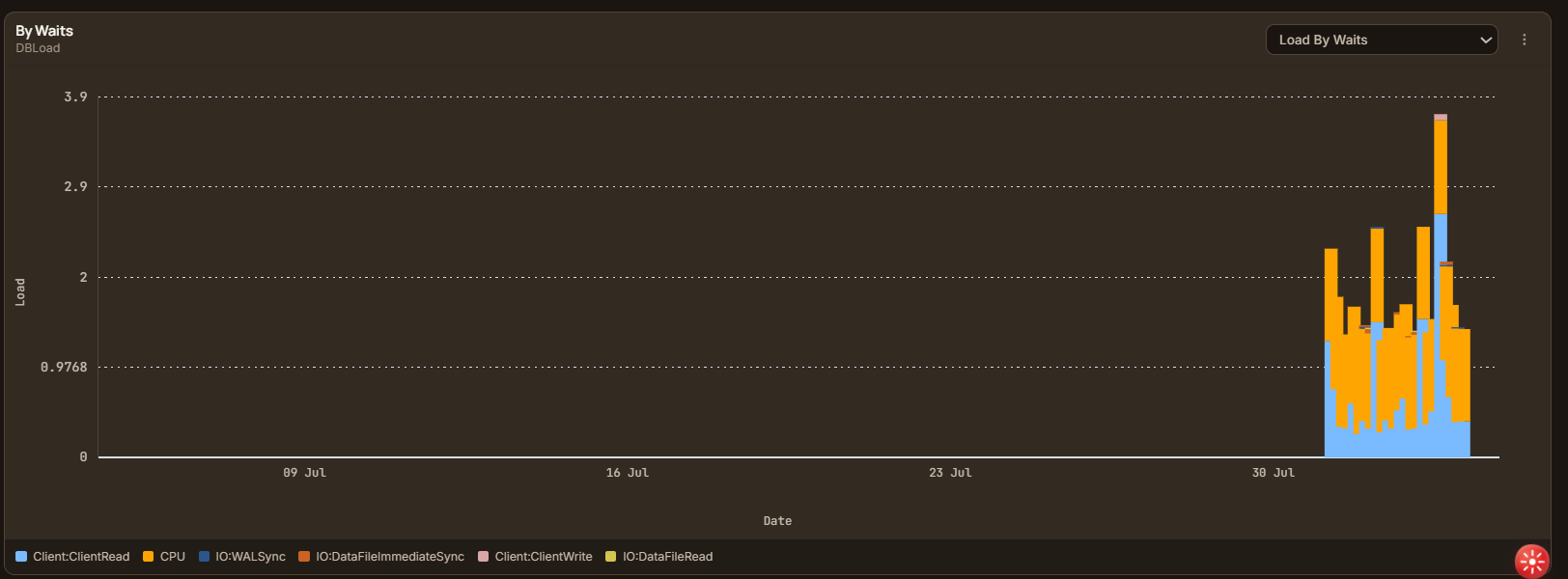
Chart Elements
- Chart Title & Metric Description: Indicates the metric category (e.g. By Waits - DBLoad).
- Y-Axis: Measures active load, session counts, execution time (sec/min), or storage size (GB/MB).
- X-Axis: Continuous timeline over the selected date range.
- Interactive Legend: Color-coded wait event types or query labels below the chart. Click any legend item to toggle its visibility on the graph.
- Metric Dropdown: Located at the top right of multi-metric charts (e.g., switching from Load By Waits to Load By Waits (Database)).
Per-Chart Action Menu (⋮)
Every chart card features an Actions (⋮) menu in its upper right corner, giving you powerful workflows directly from the visualization:
Available Actions
| Action | Description |
|---|---|
| Create alert | Opens the Alert Configuration wizard prepopulated with the chart's current metric and database context. Set thresholds (e.g. CPU > 80%) for automated notifications. |
| Add to dashboard | Pins the current chart tile to a custom user dashboard for cross-functional monitoring. Asks for a Name (required) and an optional Description first, both prefilled from the chart's own title so you can accept them and move on. See the note below on how pinned charts are drawn. |
| Export as image | Downloads a high-resolution PNG snapshot of the chart for presentations and documentation. |
| Export as PDF | Generates a formatted vector PDF document of the chart and associated data points. |
| Share graph | Grants view access to this chart to users in your tenant that you pick instead of copying a link. Only the chart's owner sees this item. Once shared, it reads Share with more users so you can add recipients later. See the note below for where they find it and what sharing grants. |
Share graph opens a dialog to pick users from your tenant; it does not create a link. You cannot share with yourself, must select at least one user, and the picker shows up to 100 matching users per page ("Showing N of M users. Refine your search to find others." appears beyond that). Confirm with Share (N). If the share is rejected, the dialog remains open and shows the server's reason as a toast.
Sharing a graph also grants each recipient view access to the underlying data source because the chart-data endpoint checks that permission. A recipient finds the read-only chart on Dashboards, under the Shared workload tile, grouped by the user who shared it. The tile only appears once a graph has been shared with them. The chart reruns against the owner's data source, so its values remain live rather than becoming a snapshot.
After sharing, the owner's Actions (⋮) menu includes Stop sharing. Stop sharing revokes the graph for every recipient at once; it does not support per-person revoke and deliberately leaves the data source's view grant in place, so recipients keep access to the data source itself afterward. Sharing is unavailable for charts over a DataDios data source. See A DataDios data source cannot be shared.
A dashboard tile keeps the chart you pinned: the same shape, axes and unit, even if the Performance Analyzer's chart definitions change later. A line chart broken down into several series (one line per wait type, per database, per query) keeps every series, and a stacked bar chart stays stacked. Point at a tile, or tab into it, and its action bar appears; its chart-type buttons offer only the views that chart allows, starting with its own. On your own dashboard the view you pick is saved, and the tile opens on it from then on; on a dashboard someone shared with you it isn't. A tile with no pick of yours opens on the view saved with the pin, so an older several-series tile that was saved as a table still opens as one; point at it and pick its chart. See Card actions for every button on the bar.
A chart broken into more than eight series — a multi-line trend or a stacked bar — keeps only the eight with the largest totals and says so above the chart ("Showing the 8 largest of <N> series by total."). The rest are left off the tile rather than crowding it.
A tile draws lines, vertical and horizontal bars (plain or stacked), distribution bars, pie charts, KPI cards and tables. A stacked bar draws whether its series come from one breakdown column or from several value columns. A horizontal bar chart gives each row its own band, so a tile showing many rows scrolls rather than squeezing the bars together. A distribution bar is one bar split into a segment per category, each sized by its share of the total, with a legend giving each category's value and percentage; a category whose value is zero is left out. A pie chart gives each category with a value above zero its own slice. KPI cards show one card per value, read from the query's first row; if the query returned more than one row, the tile says how many there were. A plain (unstacked) bar chart split into several series isn't drawn on a tile yet, so the tile lists the rows as a table under a short line saying so. The chart's other allowed views stay among the chart-type buttons. Open the chart on the Performance Analyzer page to see it in its original form.
A plain bar chart keeps the order the query returned its rows in, as it does on the Performance Analyzer page, and bar and line charts grow to fill a tile you drag taller. Axis labels shorten large numbers (3k, 1.3M, -3k), and a whole number under 1,000 shows without a trailing ".0".
A tile whose query returns no rows says so: "The query returned no rows, so there is nothing to draw." If the rows lack a column the chart plots, usually because the query changed after the chart was pinned, the tile names the missing column instead of drawing an empty chart. A bar, line or pie chart whose query returns a single number shows it as one KPI card, labelled with what it measures.
A tile pinned as a table, or switched to its Table view, shows every row it loaded (up to 1,000, and
it says so when the query returned more), 50 to a page by default (10, 25 or 100 if you pick another
page size). Click a column header to sort by it.
Numbers line up on the right. A column the server reports as a number shows thousands separators,
except one whose name marks it as an ID (id itself, a name ending in _id, _key or _hash, or queryid,
dbid or userid), which prints as written so it copies and reads correctly. A column the server
doesn't type prints its numbers in full. A cell whose text is cut off gets a copy button, and a Workload load column draws its
in-cell bar. A missing number or date shows as NULL, distinct from an empty cell; a missing text
value arrives from the server already empty, so it shows as blank.
A tile that shows a table only because its chart isn't drawn yet previews the first 20 rows with a View more button that expands up to a 100-row cap.
Tiles pinned before the dashboard began saving a description of how to draw the chart look the chart up by the columns the pin did save. If that lookup can't settle on exactly one chart, the tile never guesses. It shows one of the yellow notes below and lists the rows as a table, so a tile showing none of these notes either saved its description or found its chart:
| Note on the tile | What happened | What to do |
|---|---|---|
| matches N chart definitions and won't guess between them | More than one chart fits what the pin saved. | Open the chart on the Performance Analyzer page and pin it again. |
| no longer matches a chart definition | The chart the pin came from has been removed or renamed. | Pin its replacement from the Performance Analyzer page. |
| The server didn't say how to draw this chart | The DataDios server is older than the dashboard and sends no drawing descriptions. | Ask your administrator to update the server. |
| chart definition didn't load | The chart definitions couldn't be fetched. | Click Retry on the note. |
Pinning a chart again saves its drawing description, so the new tile never needs the lookup. Remove the old tile once the new one is in place.
An insight tile is the one exception. Pinning a TopN, Comparison, Forecast, Anomaly, or Association insight from the Overview tab keeps its own native chart — it is never translated to a line, bar, or table. A TopN/Comparison/Forecast/Anomaly insight re-fetches its source row each time the dashboard loads, so if that insight has since aged out of retention, the tile shows "This insight is no longer available." instead of stale data. An Association insight is pinned as a snapshot of what you saw at pin time, so it keeps displaying the same association description indefinitely rather than re-checking it.
Switching Chart Metrics & Views
Charts with multiple available dimensions allow real-time metric switching without reloading the entire page.
For example, on the DBLoad chart tile, selecting the metric dropdown lets you switch between:
Load By Waits: Stacked breakdown by wait event category (CPU, ClientRead, WALSync, DataFileRead).Load By Waits (Database): Aggregated DB load broken down by database.Load By Waits (Host): DBLoad grouped by client host IP / hostname.Load By Waits (BackendType): DBLoad grouped by worker process type (client backend, autovacuum).Load By Waits (Application): DBLoad grouped by connected application name.Load By Waits (User): DBLoad grouped by database user account.